
Graphic Design + Illustration
Patico - Toys and Daycare
BRANDING PACKAGING MERCHANDISE

A daycare and toy store that connects children with the arts, serving the community by hosting workshops and selling artisanal, handmade goods.
The Challenge: Create a brand for a small business that serves the diverse Hastings-Sunrise community in Vancouver.
The Solution: Patico supports the high population of local artists and single parents in East Vancouver, and brings the community together with day care, classes and cultural takeovers. This store uplifts the East Van community, showcasing its products and talents, and inspiring its next generation of artists.
THE PROCESS
Research
Hasting Sunrise’s eclectic atmosphere is a reflection of the high density of artists that live and work in the neighbourhood. There is also a high population of seniors and children, and research shows that Hastings Sunrise is primarily populated by families and immigrants. Of these families, a many of them ara single-parent homes, where the parent is the sole breadwinner.
Diverse, hard-working , middle class, eclectic, community-forward.


Brand story:
A middle aged latina immigrant named Patricia that worked as an art teacher in BC for years, decides to make a change for herself and her community. She opens a toy store that sells work from local artisans, and specializes on plastic-free, hypoallergenic, handmade toys.
The store also provides daycare and art workshops, hosted by Patricia and other featured artists from the Hastings-Sunrise community.
The name "Patico" comes from the Spanish word for gosling or duckling, which aligns with the young demographic of the toy store. It also has a light, fun energy that makes it pop, but remains ambiguous enough as to not alienate older children and teenagers.
LOGO DESIGN
Sketches
I explored various takes on the duckling theme, as well as looked at plenty of established toy brands for reference.
After selecting favourites, I explored color palettes for the main logo.


The logo for Patico is characterized by its handmade feel, using a custom lettering, and a “wonky” playful energy in its stylization.

Primary logo

Wordmark

Additional colors
Submarks
These help categorize the audience for the toy store wares and its events.


Baby Gosling
Meant to be used to categorize events or products determined for children ages 3 and under

Pictorial
Kid Gosling
Categorize events or products determined for children between 4 - 9 years of age.
Tween Gosling
Meant to be used to categorize events or products determined for children ages 10 and up.

Full Signature
BRAND ELEMENTS
COLOUR PALETTE
Inspired by Riso Printing , the colors are made by different densities of three different hues of ink. In this case, pink, yellow and blue, when combined using a Multiply layer, these create a varied of different shades, mainly the primary brand egg yolk and a deep purple.


SHAPES, LINES, PATTERNS
APPLICATION
I created stationary and assets for internal use that carry through the playful and creative values of the brand.
Letterhead
The dotted line is a playful element that carries through to the next page, and connects the two pages.
Envelope
This makes a reference to classic postage, with a stamp that reads "DUCK MAIL. Kindly beak-delivered".
Business card
Inspired by paper crafts and buildable toys, this card allows customers to cut out and assemble their very own Patico.

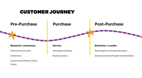
CHARTS AND GRAPHS

Organizational Chart
Following the organic flow of Chutes and Ladders, this chart encourages play and promotes equality among the team, without a visible hierarchy.

Informational Pie Graph
Timeline Graph
TOUCHPOINTS
Flyer - Opening Calendar
The opening calendar is the first introduction to the brand, spread around town physically in pamphlets and stuck onto poles around East Hastings. This print would be made using a Riso Printing technique.


Collectible Trading Cards
To ensure customer retention, the trading cards were designed as an interactive record of the child's attendance and learning achievements in the day care sessions and workshops. Every attendee is given a small set of these cards after each class, with which they can challenge each other to duels, as inspired by Pokémon trading cards.
Collectible Rubber Duckling
As an add-on for the cards, customers can also collect rubber ducks related to the workshop they've attended. For example, a painter duck for kids who attended paint class.
Packaging
The cards and duck all come in a foldable box which also includes instructions, so kids can play with friends and foster a sense of community.


Fonts used:
Patico logo: Handmade by me
Branding font: Omnes by Darden Studio
