This Spells Disaster!
PRINTING LAYOUT ILLUSTRATION

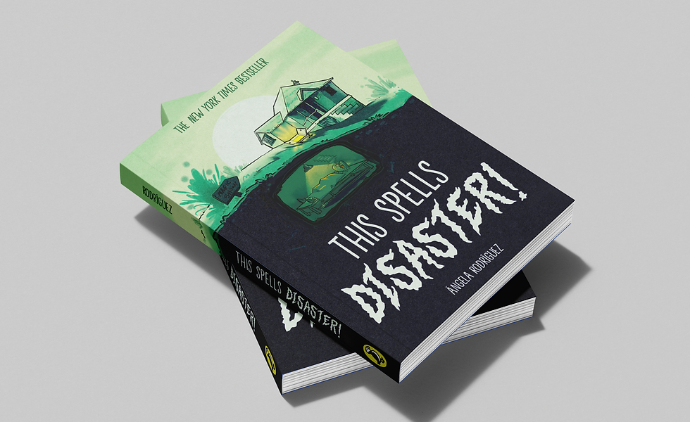
Illustrated children's book cover design for a fictional children's novel called "This Spells Disaster".
The Challenge: Design a book cover that will appeal to young readers, aged 8-16.
The Solution: Create an design that encapsulates the whimsical and magical, inspired by Lemony Snicket and Neil Gaiman.
THE PROCESS
Field Research
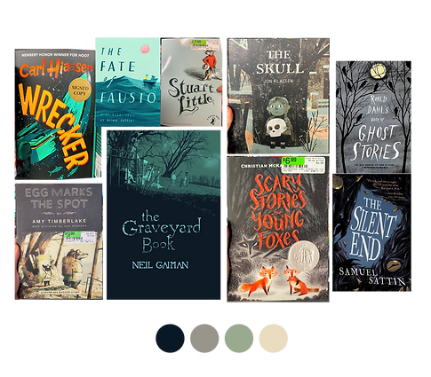
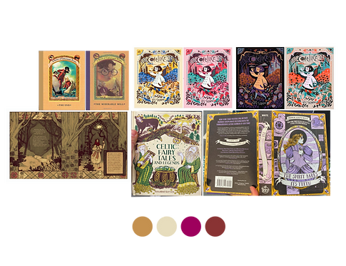
Hit a few different local book stores and analyze and categorize different book cover art styles for the desired audience.
Concept: Ornate Gothic Places
Design Elements: Gothic style illustration, spooky manor and simple character. Ornate serif or handmade font, curved lines.
Textured hatching. Illustration heavy.
Muted greens and jewel tones.

Concept: Contemporary and Simple
Design Elements: Use of negative space in composition. Text and illustration are balanced or text is main focus. Sans serif fonts. Simple style characters. Neutral colour palette.
Concept: Vintage and Framed
Design Elements: Illustration framed and centered. Balanced or symmetrical compositions. Bold, warm colours Elegant serif font. Detailed characters.


Thumbnail sketches:
Based on the research findings, I created two thumbnails per concept

Tests:
Color and values were placed onto the two final thumbnails. The limited colour palette, the ominous monochromatic greens, and a pop of orange drive the eye towards the cadaver underground.
THE FINAL DESIGN

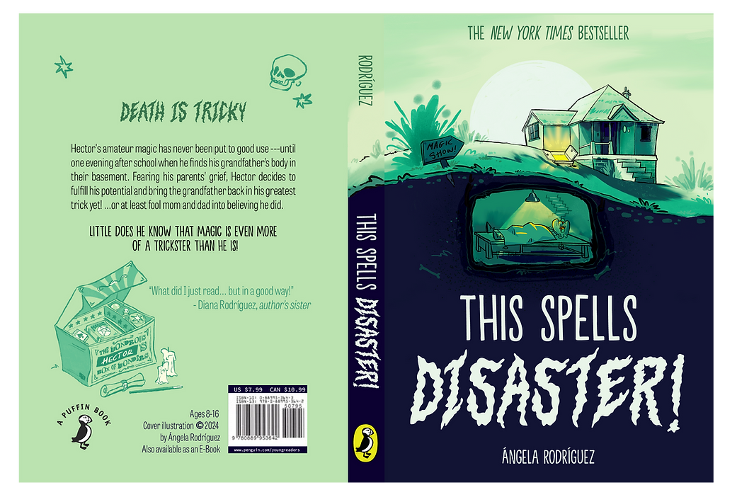
For the final design, I created a spine and a back cover to match the illustration.
The theme of the story revolves around what ended up being my design’s message: The horrors of having difficult conversations with your parents! I tried to achieve this by sticking to an absurdist tone with the illustration style, colour and font choices, along with the concepts I chose:

Fonts used:
Main Font: Background ECHO by Hanoded
Secondary Font: Devil’s Haircut by Pintassilgo Prints.
Body: Tablet Gothic Compressed by Type Together

